
The Video Analytics Dashboard is a powerful analytics tool in dadan that provides deep insights into how your videos are performing across your entire workspace. It aggregates data on views, audience behavior, engagement, and geographic reach, helping content creators, marketing teams, and organizations measure the effectiveness of their video content, identify trends, and make data-driven decisions to improve future videos.
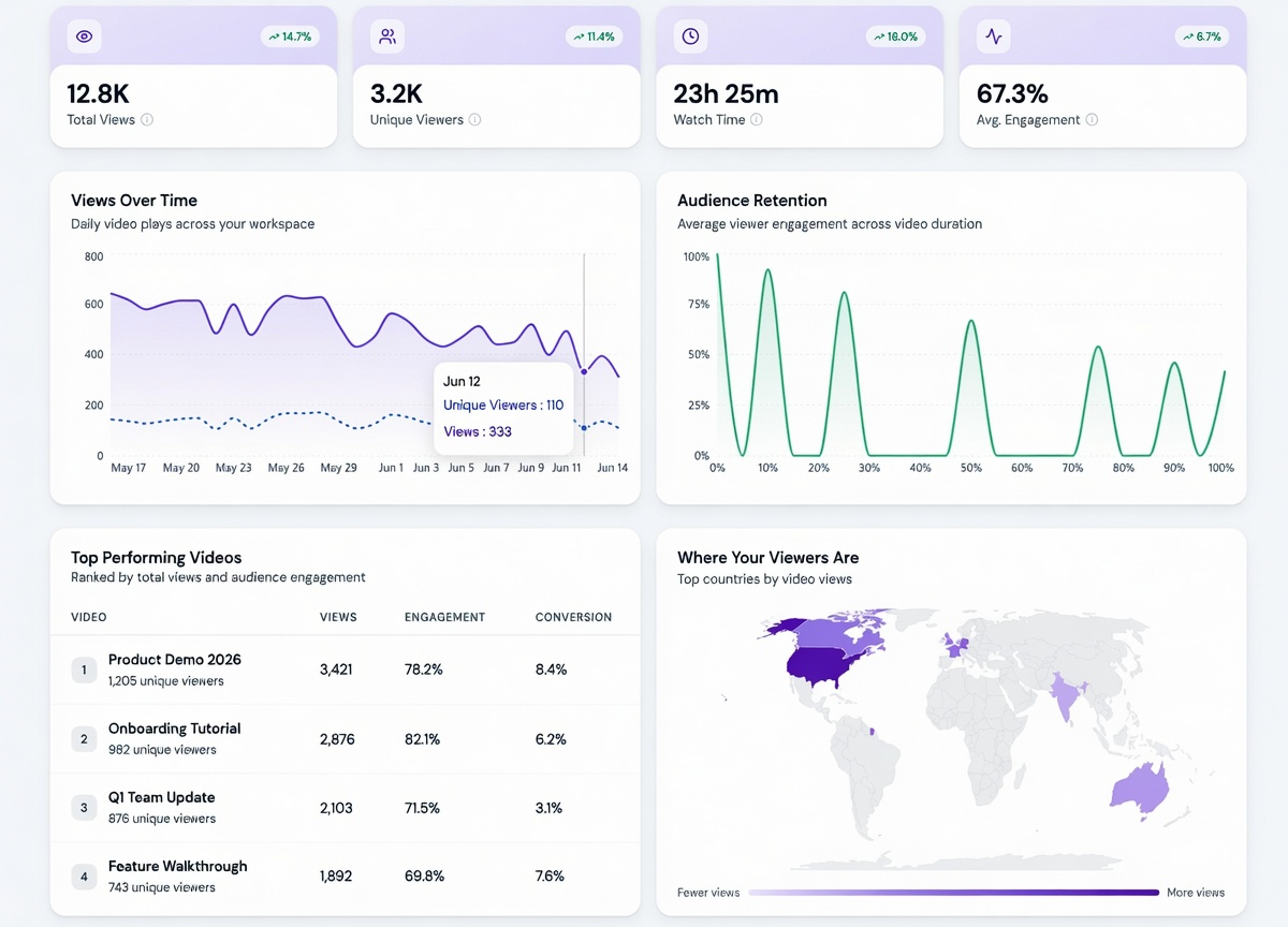
The dashboard displays real-time or period-based metrics and includes interactive visualizations for easy exploration.
Access dadan video analytics dashboard #
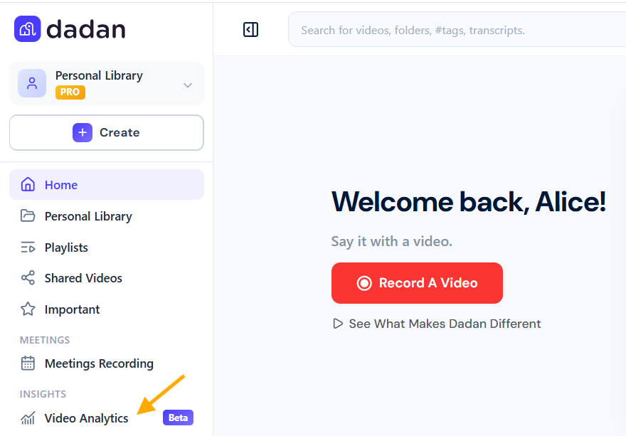
To open the dadan video analytics dashboard:
- In the left bar on your dadan web app, open the Video Analytics link.
Key performance indicators (top-level metrics) #
At the top of the dashboard, four prominent cards summarize the most important overall statistics:

These metrics are accompanied by trend indicators (green upward arrows) showing performance compared to the previous period.
Views over time #
This section features a dual-line area chart displaying daily video activity:
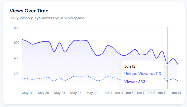
- Primary line (solid blue): Total daily views.
- Secondary line (dotted blue): Unique viewers per day.
Key observations from the chart (e.g., May 17 – June 14):
- Views generally fluctuate between 400–650 per day with some dips.
- A noticeable tooltip example on June 12 shows: 333 Views and 110 Unique Viewers.
- The chart helps identify peak performance days, content launch impacts, or weekly patterns.
Use case: Spot seasonal trends, measure the success of recent video campaigns, or correlate spikes with specific marketing activities.
Audience retention #
This graph shows average viewer retention across the normalized duration of videos (0% to 100%).
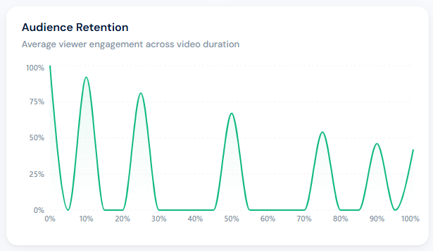
- The green line starts high (near 100% at the beginning) and drops at various points, with several strong “peaks” where retention recovers.
- Notable drops occur around 5–10%, 25–30%, 45–50%, and 70–75% marks, while strong retention moments appear around 15%, 35%, 55%, and 85%.
Insights:
- Early drop-offs may indicate weak hooks or slow starts.
- Recovery peaks suggest compelling moments or effective chapter markers.
- Overall, the 67.3% average engagement rate is solid, but analyzing this graph helps identify which parts of videos need improvement.
Pro tip: Use retention data to edit videos, trim low-retention sections, or add calls to action at high-retention moments.
Top performing videos #
A ranked table of the best-performing videos based on a combination of total views and audience engagement.
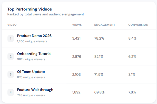
Columns explained:
- Views: Total play count.
- Engagement: Average % of the video watched.
- Conversion: Likely tracks specific actions taken after/during viewing (e.g., sign-ups, downloads, clicks).
This section is excellent for benchmarking content types (demos, tutorials, updates) and replicating successful formats.
Where your viewers are #
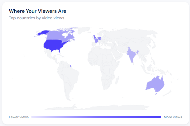
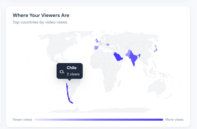
An interactive world map visualization highlighting viewer distribution by country, using a blue gradient (lighter = fewer views, darker = more views).
Highlights:
- Strongest region: United States (darkest blue).
- Notable presence in parts of Europe, India, and other scattered countries.
- The map includes a legend: “Fewer views, More views”.
Note: If you hover over a highlighted country, you can see the total number of views for that country (e.g., Chile: 2 views).
Benefits:
- Understand geographic reach.
- Tailor content to dominant regions (language, cultural references, time zones).
- Identify opportunities for expansion into new markets.
Conversion performance #
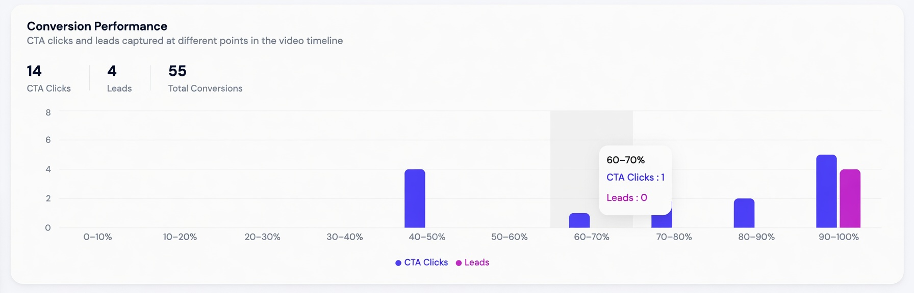
This section provides a detailed view of how effectively your videos drive actions from viewers. It breaks down CTA (Call-to-Action) clicks and leads captured at different points throughout the video timeline.
Conversion timeline chart #
A stacked bar chart visualizes conversions across 10% intervals of video duration (0–100%):
- Blue bars: CTA Clicks.
- Purple bars: Leads.
Highlights from the data:
- Strong conversion activity in the 40–50% mark (4 CTA clicks).
- Another peak in the 90–100% segment (5 CTA clicks + 4 leads).
- Lower activity in mid-video sections such as 60–70% and 70–80%.
- A tooltip example at 60–70% shows 1 CTA click and 0 leads.
Insights & recommendations:
- Videos perform best when CTAs are placed near the middle and especially at the end.
- High conversion zones can inform optimal placement of calls-to-action, product links, or lead capture forms.
- Use this data to test and refine CTA timing, for example, moving generous offers to high-conversion timeline segments to boost overall results.
This feature helps quantify the real business impact of your video content beyond simple views and watch time.
Traffic sources #
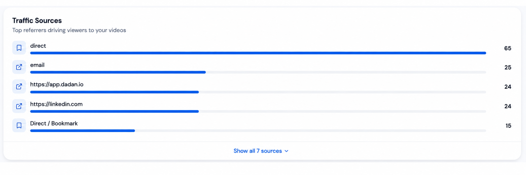
This section shows where your video viewers are coming from, helping you understand which channels and platforms drive the most traffic to your content.
Top referrers #
A clean horizontal bar chart lists the leading traffic sources with their respective view contributions:
Note: The dashboard shows the top 5 here with an option to expand to all 7 sources.
Key observations:
- Direct traffic dominates, indicating strong brand awareness or effective internal promotion.
- Email marketing is a significant driver, suggesting well-performing email campaigns.
- LinkedIn and the dadan app itself are important referral channels.
- The data helps identify which external platforms and tactics are most effective at bringing in viewers.
Use cases:
- Allocate more budget to high-performing channels (e.g., scale successful email campaigns).
- Optimize for platforms showing lower performance.
- Track the effectiveness of cross-promotion and sharing strategies.
This section completes the audience acquisition picture, complementing the geographic insights from the world map.
Single video analytics #
This panel displays key engagement metrics for an individual video, giving creators a quick, at-a-glance overview of video-level performance.
To open the single video analytics panel,
- Open the video you want.
- In the upper right side, click the Views button.
- Click the Views Analytics button in the Viewer Engagement dropdown box.
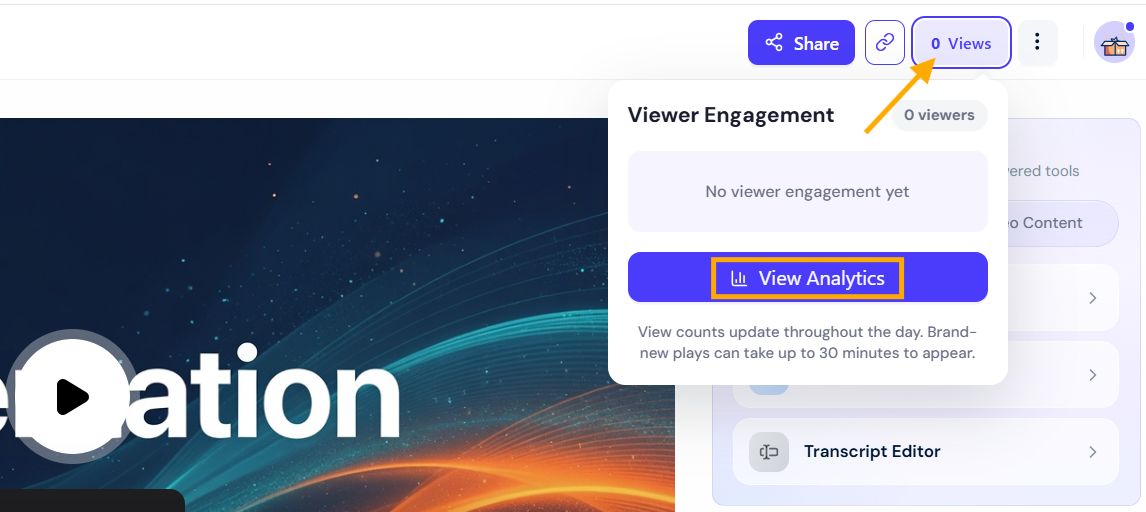
- The Viewer Engagement panel for the video will open on the right side.
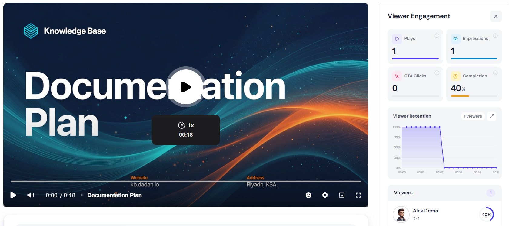
Viewer engagement panel #
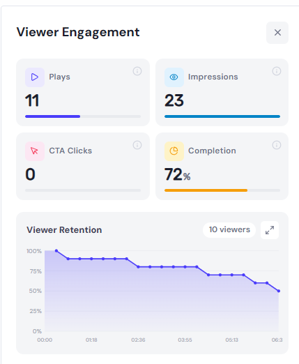
Engagement metrics #
Viewer Retention graph: A detailed line chart shows the percentage of viewers who continued watching at different points in the video timeline (from 00:00 to 06:30+).
- The retention starts near 100% and gradually declines.
- A notable drop occurs around the 02:36 mark.
- Another visible drop happens after 04:14, where retention falls from ~80% to lower levels.
- Tooltip example: At 04:14, 80% of viewers (8 out of 10) were still watching.
Insights:
- The 72% average completion rate is strong, indicating good overall viewer interest.
- Retention analysis helps identify which parts of the video hold attention and where viewers tend to drop off (e.g., for future editing or content adjustments).
This view is perfect for evaluating the effectiveness of a specific video in isolation.
Viewers list #
This section provides a granular list of everyone who watched the specific video, along with their individual watch-duration percentages (completion rate per viewer).
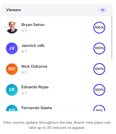
Notes: View counts update throughout the day. Brand-new plays can take up to 30 minutes to appear.
Use cases:
- Identify highly engaged audience members for follow-up.
- Understand repeat vs. new viewers.
- Segment your audience based on completion behavior for targeted re-marketing or personalized content.
These single-video analytics complement the overall dashboard by allowing deep dives into individual content performance.
Track Lead Engagement #
Dadan’s video analytics help you understand how viewers interact with your videos, while in-video lead forms capture contact details from interested viewers. Leads can be viewed and exported from Dadan, or sent to connected marketing and CRM tools such as HubSpot.


